Saturday, November 30, 2019

Watercolour Paintings Find New Homes

Watercolour Series: Red Rock

These five paintings were painted on location this spring in Utah and were shown at the recent Images Art Show that I participated in. What wonderful country to hike in. I so enjoyed trying to capture the essence of a different landscape than what I am used to. It required some different coloured paints than my regular palette.

'Devil's Garden'
watercolour by Eileen Gidman 
 Off to it's new owner. This was a smaller area of red rocks that made it all the more special. Lots of families were visiting as it was easy for children to walk right up to the rock formations.


'Red Rock Canyon'
watercolour by Eileen Gidman
 Off to it's new owner. This was painted near the Visitor's Centre of Red Rock Canyon, near Bryce Canyon. What an amazing park that was. The spires to the left were called the 'Salt and Pepper'.


'Snow Canyon'
watercolour by Eileen Gidman
Off to it's new owner. A chance encounter lead us to this lovely little park where we enjoyed our first hike. When I look at this painting, I can still remember how solid that red rock felt to walk on.


'Kodachrome'
watercolour by Eileen Gidman
Am I ever glad we ventured forth to this park. The afternoon hike, which I participated in, was through a slot canyon. Just wow!


'Grand Canyon Ranger'
watercolour by Eileen Gidman
This was my second time to the Grand Canyon but only my first time really seeing it as the first time the canyon was filled with fog. We had a very special tour guide who pulled in at every view point and gave us lots of time to explore.  


Thursday, November 14, 2019

Art Show - Images in Creston, BC


Images Show, Creston, BC
While the core group of artists has changed throughout the years, this is the 22 consecutive year of this much anticipated show. Elaine and Andy Alfoldy are the longest attending members and the Images Group is happy to announce its newest member, Jenny Steenkamp. This show also features Eileen Gidman, Laura Leeder, Sarah Miller, Jim Smith and Howard Smith. If you are in our area, I hope you can visit.
Images Art Group Facebook Page


When framing for two days last week, I realized that all of the 22 new paintings I am showing this year were painted plein air with finishing touches in the studio. Wow, I had a goal this year to plein air paint more and I guess you could say I achieved that. It was an exciting year with painting locally in the valley, including weekly in the summer at Kootenay Meadows Dairy, painting in Utah on a spring hiking trip, in AZ, and on Quadra Island. 


watercolour by Eileen Gidman
16 X 20" (framed 22 X 28") 

The colours on these pear trees were jaw-dropping stunning this year. After walking up to admire them, several times, walking back I noticed this vista with the Purcell Mountains in the background. The very next day I spent an afternoon painting them. This old orchard is near my home and I've been researching the history of the trees. I believe them to be over 100 years old and I want the title to reflect the historical significance somehow. Ideas?
And yes, that cat did walk into my view.

watercolour by Eileen Gidman
Series: Hulls of Herriot Bay

More boats. I do not have a title for this one yet either but the series will be called 'Herriot Bay Hulls'. The heron on the left side of the painting would often stand in the shallows when the tide was low.


watercolour by Eileen Gidman
View from Gramma's Clothesline

This is this year's painting for my Clothesline Series. The significance of the series is to draw attention to energy conservation. It is the first clothesline painting without clothes drying on it but the view was so amazing that I wanted it to shine. When showing the painting to the home owner, her grandson was there and his eyes just lit up when he recognized the familiar scene, hence the title. 

Friday, November 1, 2019

How Do You Choose Where to Set Up On Location?

Choosing Where to Set up for Painting on Location


Watercolour by Eileen Gidman
'Getting Married in a Month' 

To give you an idea about how a painter chooses what to paint, the above painting was the last painting I did on an artist retreat that I, Eileen Gidman took to Quadra Island with a fellow artist, Karen Arrowsmith. That Friday morning, I hoofed my suitcase of painting supplies and my folding chair with side table about a 1/2 kilometer up the hill to the top of the road from us. I had been getting a view each time we drove back to our cabin that was above the bay looking through the houses to the marina. After looking for just the right place, for whatever reason, it just wasn't what was in my heart to paint that day, so I hoofed it a little farther up the road. I could see the store by that time so I hoofed it a little farther there to pick up some bread for lunch. I probably looked like a homeless person by that time as I carried my case, loaf of bread and chair with me.

In order to find that perfect stop, I decided to head down by the Herriot Bay Inn and look at the bay from there. At that time, I was still thinking of capturing a beachside cabin with the bay view. As I limped along the path above where the tide comes in, by that time using my chair like a cane, I paused at a bench and surveyed the scene below. There were these two small, new, and colourful watercraft amongst all the big sailboats and older dories.

The colours and water reflections grabbed me. The story I was trying to convey with this painting became even more special when a young man that had obviously been watching me paint, as he walked back and forth on the ramp beside me, stopped and said to me, "They are getting married in a month." At my puzzled expression, he said, "The owners' of those two boats are getting married in a month." I liked to think the specialness of that scene was what had me stop, after hoofing it around for so long, looking for the just the perfect last painting spot. 

Friday, October 11, 2019

Our Painting Retreat on Quadra Island

Watercolour painting for two weeks on Quadra Island, for two Kootenay artists, was a much anticipated 'work' venture. When plein air painting away from one's own community, one can face challenges along with the fun. Fellow artist, Karen Arrowsmith and I, Eileen Gidman turned those challenges into plusses with the help of the locals. Thank you Quadra Island people for your hospitality!

We had booked  NOODLES NOOK on Herriot Bay over a year ago having never been there. It turned out to be a perfect place to stay with a very scenic view of sailboats moored on the ocean. Being a dry lander I had no idea what coastal living was like, so in order for me to be able to paint authentically, I felt I needed to know more about the island. I talked to the locals while out painting, at the coffee shops and at the grocery stores which helped me, each time, to gain insight into their lives. How many times did I hear, I came here in 19_ _ and never left. 

I had never painted by the ocean before and never on a moving dock but that is just what I did some of those very first days. Winter was coming and boat owners were working feverously to get their boats in shape for the upcoming weather. Some people had been out sailing all summer and now it was time to get to work. In 'Shimmering at the Dock', you can just glimpse a fellow in the background bent over his work. 'The Skipper' painting depicts a beautiful wooden boat with a section of it's outer wood removed as it was being restored.

Another challenge we faced was a stretch of  rainy weather. There were some good things that came out of that though. If the weather looked iffy, I learnt to pare down my materials, sometimes working in India ink alone, so that I could quickly put things away should the rain start. Some of those paintings seemed to be people's favorites. Another fantastic thing that came out of wet weather was that our friend Margie, a local on the island, was able to secure a few places for us to paint from, that were undercover. People were most generous to let us paint from their patios. My goodness, everyone living on the island seems to have a 'million dollar' view!

Besides having a fantastic painting trip I am ever thankful, as a fellow Canadian, to meet some of the locals living in another part of our diverse country and gain a little understanding of their life by the ocean. 

Boats of Herriot Bay:

Watercolour by Eileen Gidman
'Shimmering at the Dock'

This wooden boat itself was painted with a rich burnt sienna colour. I depicted it a little brighter with burnt orange as it's paint just seemed to shine amongst the other boats. 


Watercolour by Eileen Gidman
'Living Aboard 22 Years'

I learnt that the green boat was a cement boat. I was told there is a lot more boat below the water and it was very stable for sailing. In the evening sun the light just made that wooden door glow golden against a light blue cabin. I was told the door was made of yellow cedar which is native to the area. The previous owner of this boat said he and his wife had lived aboard this boat for 22 years. When they sailed, they would meet up with friends up and down the BC coast, tying up at their dock and visiting for a few days. What a life!


Watercolour by Eileen Gidman
'The Skipper'


I admired this boat from the first day of walking along the dock at Herriot Bay. It took me a few times of being there to get the courage to sketch it in pen and ink. There was much to look at and I was there about 2 1/2 hours.  Thankfully, a thoughtful boat owner provided an umberella for shade. 

Sunday, August 18, 2019

August is Great for Painting at the Lake

The only thing better than plein air painting in August, is painting in September when it is a bit cooler.

We are thankful to live so close to a big beautiful lake. It is so relaxing to go camping there which we did this month.

Aqua Chair from Winnipeg
Watercolour by Eileen Gidman
When I saw the sun shining on an aqua blue camp chair at about 10:00 one morning, I made sure I was set up ready to paint it the next day when the sun was highlighting it once again. 


Here I am sitting in the shade of our campsite, out of that hot sun, enjoying a couple of hours of painting that aqua chair. Just wow!

Family Time at the Lake


I was sitting in my camp chair with its little attached table, perfect for plein air painting. Note the watercolour above.

Plein air painting again this week near Creston, BC.
Brittany's Flower Farm
Watercolour Sketch
by Eileen Gidman

On Thursday, my friend Linda and I cycled over to partake in the opening of a flower shop.  Brittany's Flower Farm . Touring the colourful Flower Shop and garden was just delightful. Thank you Brittany for welcoming us.  You are truly talented. 

Monday, July 22, 2019

July is a Good Month for Fabric Painting

Painting with Dyes on Cotton Fabric

Working in the heat of the summer is advantageous for the chemical reaction of the dyes with the soda soaked fabric. Warmth enhances the 'colour set' of the dyes. One thing you do have to think about though, especially if you are working on a large piece of fabric is to avoid letting the piece dry out. To minimize this, I work quickly, apply a generous amount of the thickened dye and lightly lay a piece of plastic over areas that I have completed. Moisture helps with the chemical reaction of the dyes and fabric so it is important for the dyes to remain a little damp overnight.


I always remember a hint about fabric painting from my friend Gail. When painting on the fabric, I will dip out a spoonful of the colour of thickened dye I want, onto a plate, along with any other colours I want to mix together. For instance, I might spoon out a dollop of yellow and a smaller amount of blue to mix together for green. Once I've finished painting with that colour, I might set it aside to use later in another area. Here is where the hint comes in. As my paint brush is going from the soda soaked fabric to the dye, the brush may carry soda ash back onto the dye plate. This soda ash will interact with the dye and start lessening it's colour strength. Therefore to limit this, I clean the mixing plates of the remaining dye often. Usually within every 2-3 hours or between finishing one piece of fabric and starting another. 


I share these ideas with you so that if you are ever painting with dyes, you are aware of them and thus have the greatest chance of success. It is mighty disappointing to rinse out a piece you've worked hard on and have it's colours be faded.

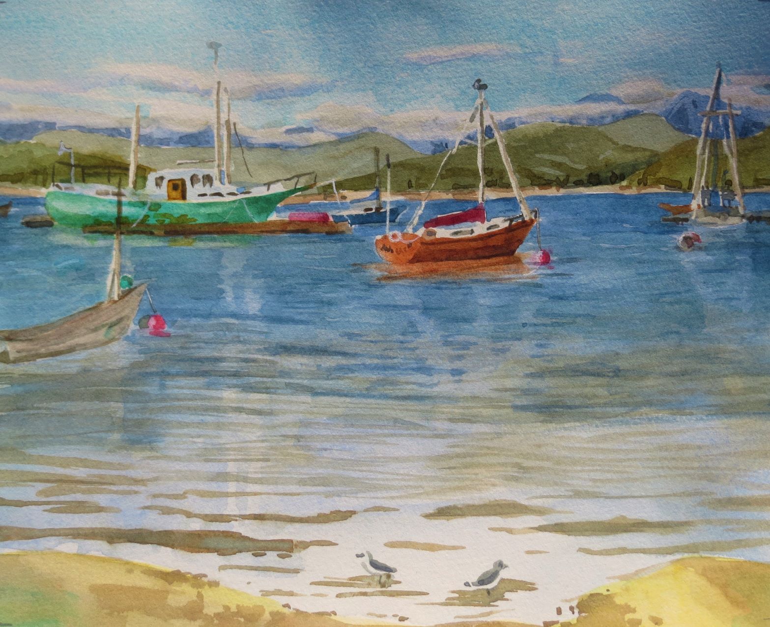
112 five by seven inch images

I've been working the last 2 weeks on these 112 images. With these small 5 X 7" pictures, I first drew the image in black dye using a bottle with a nib that I can squeeze out a small stream of black dye with. I took the extra step of rinsing the material after it had 'batched' overnight and then re-soda soaked the fabric. This was time consuming but it saved the chance of the black bleeding with the addition of coloured dyes and it allowed me to paint right over those black lines if I chose to because the black dye was set.

What beautiful gradation of colours hydrangeas have 

I admire the hydrangeas of my neighbour. Each image I painted has a reference to something in my life. I believe most artists work this way.

Border Collies and Black Labs painted with dyes on fabric
I've been painting a dog series in watercolour and so I tried painting some Border Collies and Black Labs onto fabric too.

Experimenting

The next two examples are over painting a low immersion dyed piece of fabric. Previously I had scrunched up a piece of fabric, placed it in a container, added some liquid dyes and poured warm soda ash solution over it. I am not really sure if over-painting on pre-dyed fabric, is going to be a success yet or not. When I start adding details in stitching, I will better be able to assess how this technique works. 
Note: some images are upside down and some sideways as I was working from both sides of the table.

Experimenting: Several small images on this one piece of fabric. 
 I think some of the pieces will require some additional fabrics to be stitched on top so as to show enough variance of values to see the images. It should be a fun challenge.
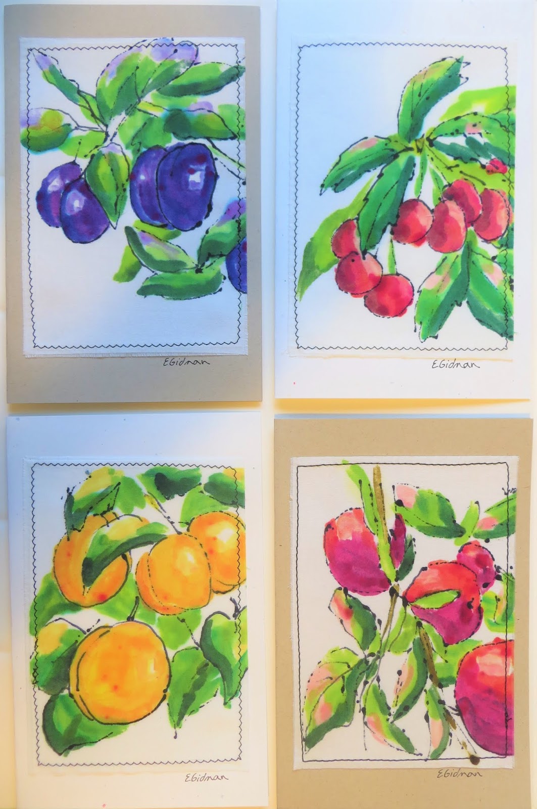
Experimenting: 12 small images that will be cut up for making textile cards

 More Experimenting

I had a little strip of cloth left over so I thought I would try some figures. In watercolour these are referred to as 'incidental' figures as they add interest to a painting but they are not detailed. I am looking forward to working on some larger textile pieces and these 'incidental' figures might just be what is needed in them.

My next step with all these small images will be to adhere them to heavy weight interfacing, cut them out and add free motion stitching details. They will then be attached to card stock for textile cards. I hope you are enjoying some creative time this summer.

Sunday, July 7, 2019

Painting with Dyes for Cards


Textile Card by Eileen Gidman


My personal favorite, of this set of 25 cards that were just recently completed, is this goose in the purple and gold. I really love the purplish tingle to the back.

Textile Card Making

At a meeting this morning, I was asked about the steps required in making the card tops. I was surprised myself how many steps there are. Painting the fabric with thickened dyes is the most time consuming but so much fun. Here are the steps to making the cards:

  1. Paint images with thickened dyes onto cotton, linen, velvet and silk fabrics.
  2. Cure and wash.
  3. Iron on 4 1/2" X 6 1/2" heavy interfacing to the back of each proposed card top.
  4. Cut out leaving an additional 1/4" all around for fringing.
  5. Fringe. (I was fringing them outside yesterday when a big gust of wind came. I was chasing card tops all over the neighbourhood, ha, ha!)
  6. Fold card stock in half. 
  7. Glue textile piece onto card top and lay under weight to dry.
  8. Sign card in case the buyer wishes to place the card in a 5 X 7" frame.
  9. Add a back label that tells what it is made with, the artist (Eileen Gidman) and a red maple leaf to signify it is Canadian made.
  10. Package in clear display bag.
  11. Label that it is original and frameable art.
  12. Add price stickers. 


Textile Card by Eileen Gidman
I left the last 1" or so of thread loose on the fisherman's line. I wanted to put a cap on the figure, but when you are free motion stitching so small, there is little opportunity for maneuvering so it looks more like a straw hat. I kind of like how it turned out though.

Textile Card by Eileen Gidman
How did I get such vividness with this purple? All I can say is perhaps using freshly made up dyes and going over the plum in successive layers. I like adding a little mauve to the leaves to suggest the reflective light on the leaves.

Textile Card by Eileen Gidman
 Fruits of the Creston Valley. Most recently we've been enjoying strawberries and raspberries. Cherries are starting.

Textile Card by Eileen Gidman
Some of the new cards available for sale at Creston Card and Stationery . None of these cards have the hand dyed velvet embellishments like the last set of textile cards I created this spring. These cards are unique with more detail in the painted image. There is still additional black thread sketching adorning them.

Textile Card by Eileen Gidman
More of the new cards available for sale at Creston Card and Stationery .


Sunday, January 20, 2019

Gold Ink


Gold Ink & Calligraphy Pens
My interest in calligraphy was reawakened recently when a took a three hour calligraphy course at our local college www.cotr.bc.ca/creston. Many years ago, I practiced writing italics for hours by a kerosene lamp in a log cabin, nestled beside a stream, and surrounded by towering cedar trees. What a magical setting that was and all that practice is helpful to me even now. 

When practicing with the ink sketching and watercolour painting, I couldn't resist trying some gold ink in this dog's beard.


Fine Tec Pearlescent Colours
This set arrived in the mail two days ago. Thank you to the people who posted about these Fine Tec colours online. They are working well with a calligraphy dip pen. The watercolour brush is used to add a little water to the compressed metallic colour disc and is then mixed. Using the brush, a bit of pigment is added to the back of the calligraphy nib for use. 


Copper colored Fine Tec pigment Practice
Pear and bird drawn with a straight nib. The leaf is drawn with a watercolour brush and the bottom irregular bit is 'scumbling' with a watercolour brush.


Arabic Gold, Fine Tec Pearlescent Colour
Trying the different colours with a dip pen and straight nib. The straight nib worked the best for me. I did not have success using a broad tipped nib (C series) for lettering. The metallic flakes showed thick and thin in a single stroke.


Practicing for 'My Life with My Human' series

More pen and ink practice with watercolour
Drawing with Speedball Super black India ink and a dip calligraphy pen. Allow to dry completely before adding the watercolour.


Combining watercolour and calligraphy on mottled card stock.
When trying a new medium, I often combine it with mediums I am already familiar with. Note in this photo and in the illustration below, I used masking tape to cover up the area to be used for the printing while painting with watercolour. After removing the tape, the lettering was added.


Practice
Combining sketching in ink, watercolour painting and calligraphy lettering. The slightly mottled coloured paper worked well for this illustrative style of painting.


Brush work 4" in height
Italics numbering using a flat 1/2" watercolour brush and thalo blue which brushes on smoothly. Being able to print this large with a brush really surprised me! I wondered about trying a house painting brush.

Illustration about Habitat for the Birds
Combining calligraphy lettering, sketching in ink and watercolour painting in an illustration.